The UWS Landmark Behind ‘Only Murders In The Building’
The show’s production designer, set decorator and art director revealed their process during an event with Landmark West and the Historic Districts Council
If you’ve stuck around the Upper West Side long enough, your memory of an earlier era of apartments may have been jogged by those shown in Hulu’s hit show “Only Murders In The Building,” starring Steve Martin as Charles-Haden Savage (aka Brazzos), Martin Short as Oliver Putnam and Selena Gomez as Mabel Mora.
Not too long ago, “these apartments were huge — and they were a wreck,” Jordan Jacobs, the show’s art director, said during a Zoom event on Wednesday night, hosted by Landmark West and the Historic Districts Council. Over the years, much has changed.
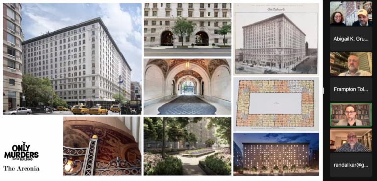
Local fans of the show were probably quick to recognize the fictitious “Arconia,” where the chaos unfolds, as the real-life Belnord, an impressive apartment building at Broadway and West 86th Street (and also a landmark). “That is the universe of this show...the building,” said Jacobs, a native Upper West Sider himself.
Conceptualizing the show’s set required excavating “so many layers of renovation” for inspiration, he explained. On Wednesday, Jacobs joined Production Designer Curt Beech and Set Decorator Rich Murray to walk through their process of creating the “Only Murders” world from scratch.
Working Through The Pandemic — On the UWS
Though the Belnord, as the “Arconia,” is integral to the show’s plot, landing there was no simple feat. “Apthorp wouldn’t have us,” Beech said of the historic Upper West Side apartment building. “And we had to fight to get the little time that we had to shoot in the courtyard at the Belnord.”
The “Only Murders” cast filmed Season 1 during the COVID-19 pandemic, when New Yorkers were reluctant to open their doors even to the closest of friends. “It was a scary, scary moment,” Beech recalled. “A hundred twenty strangers and equipment coming into an apartment? Forget about it.”
So some creative workarounds were implemented. “These three sets were built because all three of our main actors are immunocompromised,” Beech said. “The decision was made to try and control as much of this as we could. This is a huge build for a half-hour comedy, highly unusual.” They were able to shoot in restaurants that had closed during the pandemic, but filming at the Belnord was limited to the lobby and the rooftop, plus a few courtyard shots.
Research references for the show, however, were steeped in Upper West Side history; one such example was an apartment floor plan referenced for Putnam’s pad, which came from a property in the Apthorp on West End Avenue. The broader city setting proved to be just as important. Case in point: the mural in Mora’s apartment, designed by illustrator Laura Pérez. “It feels very much like New York,” Murray said.
“Guiding Principles”
Certain elements of the set stand out, despite not being linked with any character in particular — like the 75 feet of hallway space (not real, but a set). It’s the “longest hallway I’ve done in my career,” Beech said.
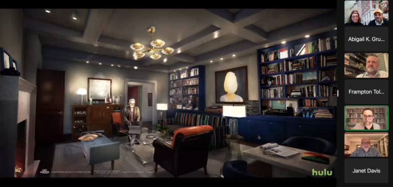
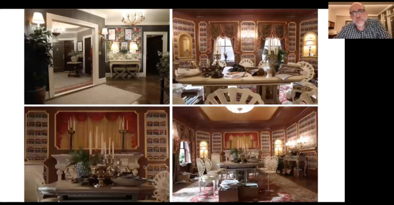
But the real stars are the apartments — and the characters they embody. For that, Jacobs, Beech and Murray stuck to “guiding principles.” Savage was best summed up by the phrase “playful sophistication,” Beech explained, and Putnam, “theatrical.” Mora was a “work in progress.”
The team speculated that Martin’s character would have renovated his space in the 90s. While furnishing his apartment on set, Murray bought one table “out from underneath” another shopper, before she could nab it. “Every three months or so, I get a text from her wondering if she can have her Steve Martin piece of furniture,” he said.
Artwork plays an important role in conveying the character, too; “Tracy,” a 2013 lithograph by Alex Katz depicting the back of a woman’s blond bob, gets at the core of his situation. “All of the women in his life, essentially, have walked away from him,” Murray explained.
In Putnam’s apartment, imagining how each piece was acquired was just as crucial as striking the appropriate design chord. “Everything in the place was stolen off of one Broadway show or another,” Beech said of the concept. Dining room chairs were dreamt up to have been taken from the musical set of “Splash” and play posters required the additional backstory of lyrics that Putnam might have once sung. “It’s a meh kind of town,” went the tune for “Newark, Newark” (so named to avoid any legal trouble).
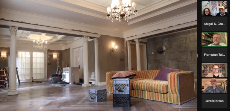
In Mora’s space, it’s texture that tells a story; her long fabric curtains, originally in pristine condition, had to be ripped to show the wear that would come with age. “It killed me, to watch it happen,” Jacobs said. “I was crying,” Murray chimed in. The torn-open wall, with plaster marks still on the wooden supporting beams left behind, was inspired by “construction zone” images and a photo of one home with the same style of wall prominently on display. The striped sofa was the “single most expensive piece of furniture” bought for the set, Murray said, essentially identical to what John Hoffman, the show’s co-creator, had in mind.
But for all the work that went into creating the perfect set, Jacobs explained, everything gets packed up at the end of each season. It’s not real, after all — even though it looks like it could be.
“These apartments were huge — and they were a wreck.” Art Director Jordan Jacobs
